Product List
Product list page is the page where user can see the list of products in a collection.
Collection List Page Blocks
Blocks in collection list page are:
| Block Name | Description | Image |
|---|---|---|
appmaker/banner | This block is used to display the banner image of the collection. |  |
appmaker/page-head | This block is used to display the title of the collection. | |
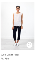
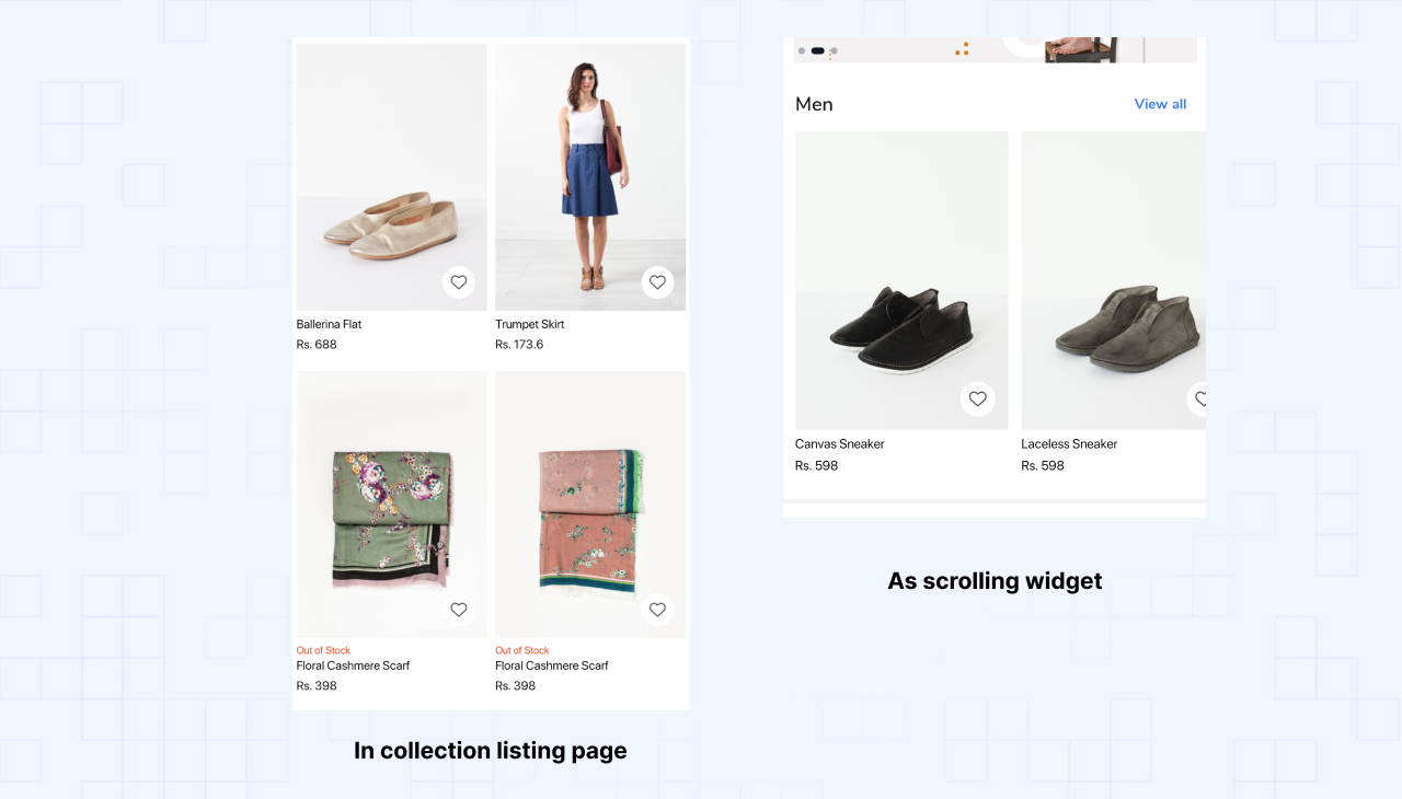
appmaker/product-grid-item | This block is used to display the list of products in a collection. |  |
shopify/collection-sort-filter | This block is used to display the sort and filter options. |
example page:

Product grid item customization example:
1. Create a new component.
Create a new react native component in folder components folder. You can use components/ProductGridItem.js as a reference.
Product grid item component (Sample code)
src/components/ProductGridItem.js
import React from "react";
import { StyleSheet, View, Image, Pressable } from "react-native";
import { ThemeText, Badge } from "@appmaker-xyz/ui";
import { useProductListItem, useProductWishList } from "@appmaker-xyz/shopify";
import Icon from "react-native-vector-icons/AntDesign";

export default function ProductGridItem(props) {
  const {
    title,
    imageUrl,
    regularPrice,
    salePrice,
    imageAspectRatio,
    openProduct,
    containerWidth,
    gridViewListing,
    salePercentage,
  } = useProductListItem(props);
  const { toggleWishList, isSaved } = useProductWishList(props);
  const containerStyles = {
    width: containerWidth,
    marginLeft: gridViewListing ? 0 : 12,
    padding: gridViewListing ? 2 : 0,
  };
  return (
    <Pressable
      onPress={openProduct}
      style={[styles.container, containerStyles]}
    >
      <View
        style={[styles.imageContainer, { aspectRatio: 1 / imageAspectRatio }]}
      >
        <Image source={{ uri: imageUrl }} style={styles.image} />
        <View style={styles.bottomRightContainer}>
          <Icon
            name={isSaved ? "heart" : "hearto"}
            size={16}
            onPress={toggleWishList}
            style={styles.wishListIcon}
          />
        </View>
        {salePercentage ? (
          <View style={styles.topLeftContainer}>
            <Badge color="#111827" text={salePercentage} />
          </View>
        ) : null}
      </View>
      <View style={styles.textContainer}>
        <ThemeText
          fontFamily="medium"
          size="md"
          color="#111827"
          numberOfLines={1}
        >
          {title}
        </ThemeText>
        <View style={styles.priceContainer}>
          <ThemeText fontFamily="bold" color="#111827">
            {salePrice}
          </ThemeText>
          <ThemeText fontFamily="regular" style={styles.regularPriceText}>
            {regularPrice}
          </ThemeText>
        </View>
      </View>
    </Pressable>
  );
}

const styles = StyleSheet.create({
  container: {},
  imageContainer: {
    position: "relative",
  },
  image: {
    height: "100%",
    width: "100%",
  },
  topLeftContainer: {
    position: "absolute",
    top: 4,
    left: 4,
  },
  bottomRightContainer: {
    position: "absolute",
    right: 6,
    bottom: 6,
  },
  wishListIcon: {
    padding: 8,
    backgroundColor: "rgba(255,255,255,0.6)",
    borderRadius: 20,
  },
  textContainer: {
    flex: 1,
    justifyContent: "space-between",
    paddingTop: 4,
    paddingBottom: 6,
    paddingHorizontal: 2,
  },
  priceContainer: {
    flexDirection: "row",
    alignItems: "center",
    justifyContent: "flex-start",
    marginTop: 4,
  },
  regularPriceText: {
    marginLeft: 4,
    color: "#DC2626",
    textDecorationLine: "line-through",
  },
});
Note: The
useProductListItemhook is used to get the data for the Product grid item. The hook is available in the@appmaker-xyz/shopifypackage. Refer to the useProductListItem
2. Register the newly created block
Register Block (Sample Code)
Register this block to appmaker blocks registry in blocks/index.js file.
src/blocks/index.js
import ProductGridItem from "../components/ProductGridItem";

const blocks = {
  {
    name: 'appmaker/product-grid-item',
    View: ProductGridItem,
  },
};

export { blocks };
3. Add / Override the block to a page
Add to page (Sample Code)
Add the block to a page by adding the block name to the page's blocks array.
src/pages/ProductListPage.js
const page = {
  name: "Home",
  blocks: [
    {
      name: "appmaker/product-grid-item",
      attributes: {},
    },
  ],
};